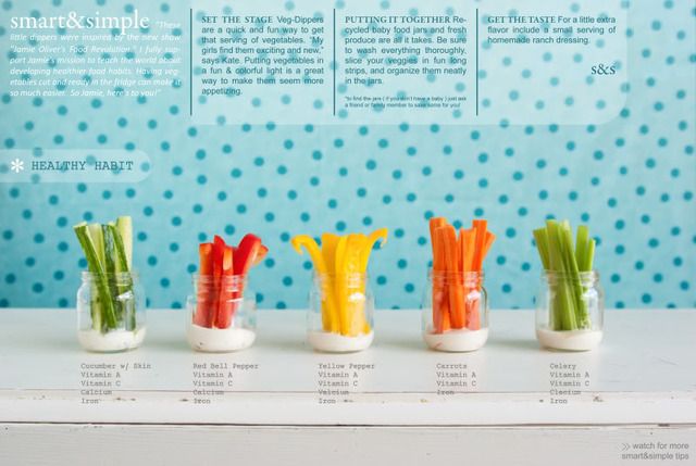
smart&simple ( s&s ) is a editorial style I am developing. I have always loved simple solutions, magazines, and photography. s&s is an experimental way for me to try and pull all of that together in 1 place. As a stay at home mother of three, it allows me to "continue my education" and share my talents. Please enjoy and share with your friends!
(photo, type and layout by: kate)

5 comments:
K8 you are so creative!! It almost makes me feel bad about myself, then I remind me to just be glad that I know someone as wonderful as you. :) The snack and the layout are fabulous!
katelyn. you blow me away. you are so talented!!! i'm excited to see these layouts as you post them. it looks straight from martha stewart or real simple. in fact at first glance i thought it was. love ya
amazed. AMAZED!!!! I really really love this. I stared at it for minutes straight, the picture IS editorially perfect. The veggies look fresh, the typeset is bomb, and smart & simple is exactly what it is. keep posting.
Wow. This looks awesome (and yummy)! I am impressed.
Hey this looks great I love everything especially the overall presentation. S&S is super catchy too - good luck with everything and let me know when you need help starting your own collection, I'll do your leg work!
Post a Comment